Creating a greeting card collection
Behind the scenes of the creative process for greeting cards
I thought it would great to share a little bit about how one of our card collections evolves from an idea in my head, to a greeting card that is bought and sent!
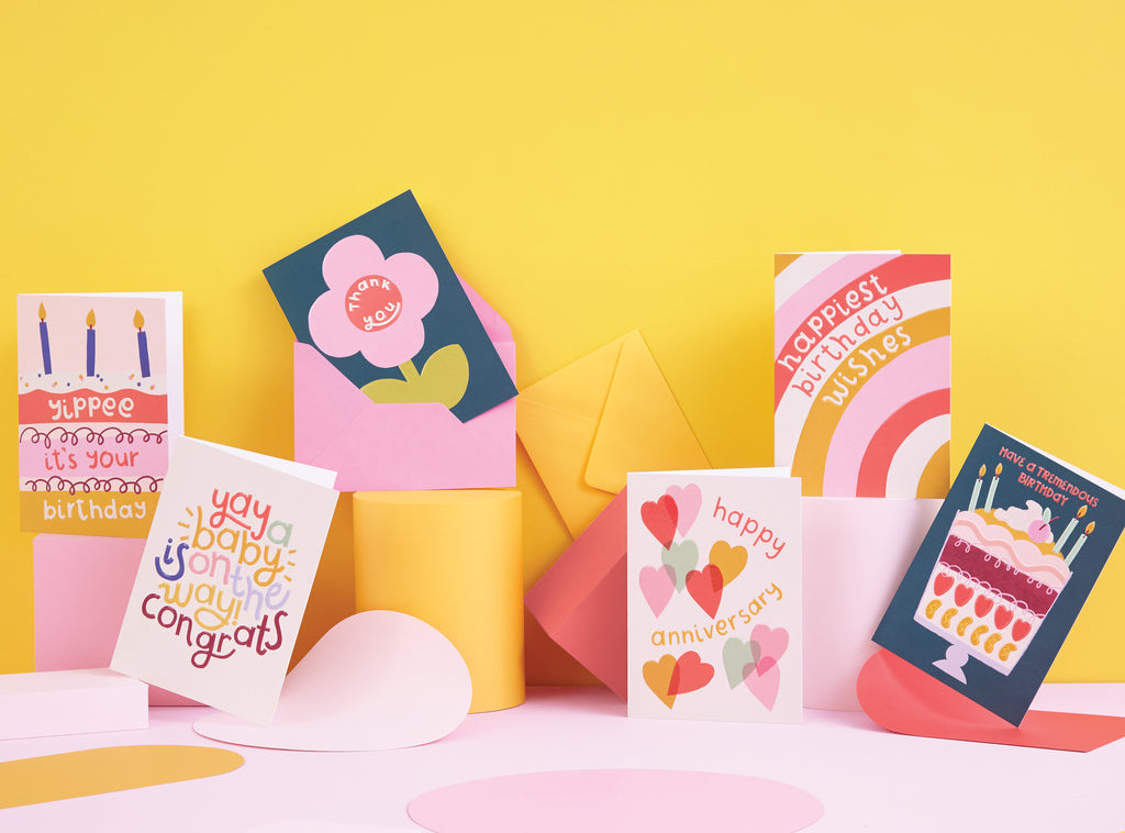
This will be a little series on this topic and first up is the ‘Good Vibes’ collection. We were so so pleased it picked-up an industry award at the TopDrawer trade show at the start of the year for ‘Exciting use of colour.’ The collection launched in January 2020 but it began its journey back in early August 2019.
My starting point is always to create a mood board by pulling together inspiration from Pinterest, magazines, Instagram and things I see when I’m out and about (obviously not so much at the minute!) I absolutely love fashion and often draw inspiration from the catwalk. I was drawn to a lot of the 60s and early 70s influence that could be seen in designer’s 2020 fashion pieces, bringing back the psychedelic bold patterns and free-spirited style of these iconic eras.
My other passion is interiors and would one day love to renovate our dream home (I have a cupboard just for vases and ceramics and a house full of cushions to Mark’s delight!). I’m loving the vibes of incredibly quirky interiors like the women members club The Wing, the colour combinations in the Paradiso Ibiza Art Hotel or the fabulous The Flamingo & the Fox insta account.
Once all of the inspiration ideas are collated together, the mood of this collection has been set; uplifting, full of colour, bold patterns and lovely sentiments all about spreading good vibes to the recipient - hence the name :-)

The next task is to decide on the colour palette for the collection; colour is definitely my thing. I love how colour is so emotive; it has a huge impact on how you feel towards a product. Also, seeing how colours change when you combine with another is fascinating. The colours you choose really set the vibe of a collection and it’s definitely one of my favourite tasks in the design process. I knew I wanted to include a sunny yellow, and punchy coral and obviously my signature pink! Also, I wanted the palette to have a dark colour that the bright colours could ping off. My favourite colour combination is pink and green and a deep dark green worked really well against the yellow, corals and pinks. And to finish off the palette, a few softer tones with a blush, mint and cream to act as a good base.

Once I have a clear vision of where the collection will head I then get a Staedtler pen and paper and start planning the cards. The number of designs in the collection was decided by two things. Firstly how many fit on a B1 sheet (the size of paper that our printer uses). Secondly following some research Marks conducts when chatting to customers, it was suggested a bigger card size would be great to add to the portfolio so we decided that this collection was a great one to trial out this new size. So with 16 fitting on the sheet, I would design eight for Birthday and the remaining eight were to be other everyday occasions. I also knew that I wanted the collection to have a mix of typography, illustration and bold pattern, it would result in strong individual looks, but work really well when merchandised all together. I draw quick thumbnail images with the layouts and message, annotating notes around so I have a clear idea before I begin to design. I will always draw more than I need as some ideas will not make the cut after initial design exploration; sometimes an idea in your head doesn’t translate as well as you had hoped.

I design a lot now on my iPad using Procreate. I bought it when I was pregnant as I suffered quite badly with sickness and the iPad gives me flexibility to work from anywhere (even my bed!) I bought a few lovely brushes from Creative Market that are chunky and have a lovely flow. The iPencil is a really great tool, it glides onto the screen and is very therapeutic to draw with. It’s a medium that I am really loving to design with at the minute.

For each design, I always draw on the iPad before taking it onto my computer and finessing in Photoshop. I print out this initial mock-up and put on the wall next to my desk. This helps me to really evaluate every design individually and see if they fit within the collection. I stare a lot at the wall and mutter “ooh I’ll tweak that”, or “that needs to change colour”, “that doesn’t stand out enough...” A bit like a crazy lady, but I think all artists have a little quirky side!

The next set of decisions in the creative process to be made is the print finish, paper and envelope colour. For the envelopes I wanted to continue the sunny vibes and what better way to have a pop of yellow. For the print finish I wanted a really tactile feel and to nod back to the glossy finish in the 70s interiors from my inspiration board. An emboss and spot-UV give that desired effect to the designs and really lift the typography, illustration and pattern.
Once all the design processes have been finalised it’s the artworking phase (this is when you get the files ready for print). If I’m honest this is my least favourite part. When I am happy with all the files, I package them up and email over to the printers. They will then send a printed proof which you check the colours and details and make sure everything is correct before going fully to print. You can see on the below photographs the print finish is on a clear separate layer which overlays onto the designs. You have to thoroughly check everything and then give the go ahead to the printers that they can go to print. You then eagerly wait with anticipation and hope that the final product is what you first envisaged back in the beginning of this design process.


I have to admit when I received the ‘Good Vibes’ cards back from the printer I squealed with delight! I was in London for the product photoshoot when I received the samples (nothing like last minute!) and Mark wasn’t with me, but I left a lengthy voicemail saying how happy I was with everything. You put a lot of love into a collection and it really is a great feeling when you love them. And I just hope you do too!


Right I better wrap it up as it is a very long blog post from me, but I suppose it demonstrates how much goes into a collection. You can shop all of the Good Vibes Birthday collection here and all other occasions here and don’t forget we handwrite a message and post to your recipient for free!
Big love,
Rebecca x
Leave a comment